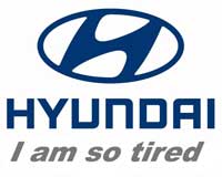
 This morning as I was passing a long row of curbside parked cars on my way to subway, I observed something, most of us know but don’t quite realize. Hyundai has the weakest logo on the block. Look at it’s closest competitor – Honda. The capital H in the logo looks almost like a bridge tower. It communicates power and stability. Hyundai’s logo looks like same bridge tower skewed to the side, like telling us that it is tired, bored and need to lean on something to keep itself up. The logo, of course, projects image on the whole brand.
Then, as I kept walking, I looked at other car’s logos. Aside from Volvo and Pontiac, who explicitly project strong and masculine image, the rest of the logos looked very powerful too. Take Toyota – the overpowered T on their logo looks like a bodybuilder from another, also familiar, emblem – Mul-T-lock. Jeep and Ford aside (guess designers were out of ideas, so they just wrote car’s make on the logo to distinguish them from same cars sold under different make) rest of the companies do a better job at logos. Four rings of Audi project unity and strong bond, thanks to remote resemblance to Olympic rings. Century-old propeller empowers BMW. Buffalo’s head looks pretty strong on Dodge. It’s hard to say what Pontiac’s logo represents as I am torn between images of rocket and phallus that are pretty similar in nature. I’m sure you’ve got the idea.
So, what’s the outcome? Hyundai, now a solid player on US market of cheap cars, should probably just redesign their logo. Yes, I know about brand recogition and associated costs, but in the long run it will benefit company’s image and profit, bringing more revenues and thus justifying the re-branding cost.