Categories
internet

Google Chrome Is On The Scene


This Blog in Google Chrome

So the Google got themselves a powerful ally. Aside from heavily sponsoring Firefox Google has now created another entity of its own.

Not to bash Google in any way, but the product (even though it’s beta) seems scarce of features. My personal annoyances follow, but in general – I am overly satisfied with the way this new browser works. The speed alone can make up for half of the list below…

– I want to see is the status bar. Aha! It only shows up when needed – i.e. when you mouse over the link or during the page load process. Neat, but a little… unexpected.

– I want to block that annoying advertising. Please, give me my AdBlock! Now! I mean it!

– I am Firefox addict, so right-clicking on the link and choosing SECOND option must open new tab. I explicitly trained myself to avoid first option – to open link in a new window, I want my links in new tabs. Please, let me switch these options.

– Flock is a foul creature, a bastard son of Firefox and social media that no one wants to deal with. Please don’t use it’s annoying yellow information bars on top – I get enough of those in IE 7.

– I really miss all the progress bars… Even from “teh dialup times” those bars were entertaining – for all those moments when I was patiently waiting for page to load. My cable connection isn’t directly hooked into Tier 1 Premium Bandwidth provider, so I get to wait sometimes. Please, give me back my nostalgic piece of history…

– It’s 2008 for crying out loud. Why do I still have to go into settings and change default encoding from Western ISO-8859-1 to Unicode UTF-8 ? Is there any specific reason for it or the whole world just started speaking Engish exclusively?

– Last, but not least. Could you possibly change that annoying blue-and-white color scheme? No, green and white would be even more annoying.

There are couple of more issues I probably missed from the first glance, but overall I have a feeling that this is a very robust product with plenty of features to follow. It may look scarce on features, but doesn’t Google’s own first page look the same?

P.S. This post has been created in Google Chrome… 🙂

Categories
internet

Google Might Serve Up Wi-Fi to Rural Areas With Ballons

Google Might Serve WiFi With Balloon - iStudioWeb.com

The Internet giant – which is now pushing into wireless services, has considered contracting with Space Data or even buying the firm, according to one person
…Google believes balloons like these could radically change the economics of offering cellphone and Internet services in out-of-the-way areas, according to people familiar with its thinking.

Right. Aside from numerous humorous comments on Digg (“Your internet has exploded”) there is a technical issue of signal strength. I just can’t imagine a balloon hanging low enough for regular WiFi to work. Unless it’s a airborne replacement for regular 3G/HSDPA towers – I don’t see that happening. If it is – I can’t even imagine how expensive it may be. Even for rural areas costs may still be prohibitive.

Categories
internet

Browser Wars – More Analysis

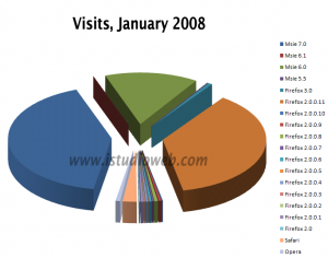
Browser Wars 2 - Small Business, Marketing and Web Design Blog As I was looking a the chart in my previous post (Are You Tired Of Browser Wars?) I realized that even this skim on data can provide enough for cheap marketing analysis. Since we’re not presenting a case study here let’s look at possibilities that small business can extract from data they already have at their possession.

The chart on the left presents the browser shares for this blog. The picture is very different. Internet Explorer has got only 56% of visits with 41% belonging to IE 7 (dark teal piece). Only 15% of you, readers of this blog, hadn’t update your Internet Explorer to the latest version, keeping your version 6 (green piece on a diagram). You are exposing yourself to much more vectors of attack then those who have IE 7. Total share of all Firefox visitors is a whopping 40% (dark orange piece of pie). Of course the picture is a bit skewed by my own visits, since I write posts via WordPress admin. But 40% looks too damn impressive. The little salmon-colored piece is a representation of Safari users – 2%. Opera – less then 1%.

What looks interesting to me is that while this blog is all about small business, most people who read it are much more computer-savvy then visitors to our client’s web site from last post. If you a starting entrepreneur just by looking at your stats you can learn a lot more about your audience. If your audience is computer savvy – you can talk more technical to them, use more sophisticated online selling tools and techniques. If your audience looks like the picture from previous post’s diagram – then you should resort to simple and proven methods, like simple contact form, phone contact, direct mailing and so on.

On the other hand – this may be your chance to find out that despite your efforts the audience that looks at your web site is just the wrong crowd.